WTPD 005 - Fleming Art Group
Main menu:
Watching the paint dry previous views
5 June 2015 - WTPD005 Wishy washy watercolours
Watercolour painting has a reputation for being wishy washy, that is very pale with little punch. While not really deserved it is still a problem and in my opinion is due to two main things, pan watercolours and a lack of tonal value contrast.
Although working with pans can produce very good paintings, for example there is nothing wishy washy about John Singer Sargent's work and he always used pans, they do predispose towards the wishy washy ones because you are building up colour density rather than diluting it down as with tubes.


However, the main cause of the wishy washy problem is the lack of tonal value contrast. Recently I gave a short talk to the group about the program, Faststone Image Viewer and I mentioned in passing that you can use it to produce a grayscale image of a photograph to help with assessing tonal value. Two days later an email from ArtTutor.com gave a link to a free ebook entitled “Number one way to improve your artwork watercolour” which is all about the importance of tonal value. I am putting it up on our server and you may download from here. If you cannot read .pdf files a good free reader is FoxitReader which you may get from here.
Tonal value is the lightness or darkness of a colour and it is the dominant feature of a photograph or painting. As an illustration of this have a look at the three versions of a photograph of a canoeist. The first is the full colour photograph, the second value-only, that is, grayscale and the third is colour-only with all the value variation removed.


While the value-only version is perfectly recognisable although the red sleeves are 'lost' the colour-only one is virtually indecipherable as an image except for the red sleeves! This demonstrates the dominance of value in the design of an image. The value-only that is, grayscale, version, of a photograph can be used very effectively in the 'design' or composition of the painting. I have written a Technical Note TN003 on how to use Faststone Image Viewer to produce a grayscale image.
It is often said that you should do 'a tonal sketch' before starting a painting, fine, but what are you looking for? The “Number one way to improve your artwork watercolour” book helps a lot in this respect especially with its study of tonal value contrast. One of the authors, Bob Davies has also produced a video explaining the concept which may be found on YouTube, this is 15 mins worth watching.
Ideally a painting should exploit the full tonal value range available although there are of course exceptions to this. You may want a high or low key painting in which case you will deliberately discard some of the tonal value range, as Michelle Himes has done in these two paintings.


Generally using the full range will give paintings with more punch than those limited to the middle of the range.
The maximum tonal value range that can be achieved is governed by the white of the paper and the darkest 'black' available in watercolour paint. Watercolour paper is generally quite cream coloured and is far from white this is because of the gelatine used for sizing. Some manufacturers have introduced 'whiter' papers, for example, Saunders Waterford High White, Fabriano Extra White and Arches Bright White. There was some initial concern that they had used Optical Brightening Agents (OBAs) which would effect their permanance but this has now been discounted. A comparison of various papers I found on the WetCanvas blog is shown below, the upper strip is copier paper for comparison.
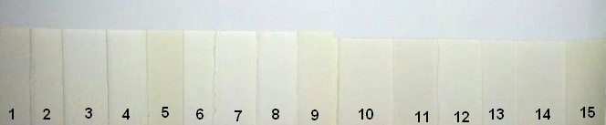
1. Lanaquarelle Rough
2. Lanaquarelle HPress
3. Fabriano Artistico X White Rough
4. Fabriano Artistico X White Cold Press
5. Saunders Waterford Cold Press
6. Lanaquarelle Cold Press
7. Canson
8. Fabriano Artistico X White Hot Press
9. Fabriano Artistico Tr White Cold Press
10. Fabriano Artistico Tr White Hot Press
11. Arches Watercolor Rough
12. Arches Watercolor Bright White Rough
13. Canson Montval
14. Arches Bright White Hot Press
15. Jack Richeson
Although the lighting is not perfect some papers are distinctly whiter, for example, 8 Fabriano x White is brighter than their traditional papers, 9 and 10 but none of them touches the copier paper which almost certainly contains OBAs which is why it yellows so rapidly! So we are immediately limited at the light end of the range.
The dark end is also limited by the blacks we have available. We are told not use black in our paintings but the real advice should be not to use the various carbon blacks, that is, lamp black and ivory black because the carbon dries to highly reflective particles which reduces its darkness and makes it appear dull. Mars black which is a ferric oxide is better producing a more intense black than carbon.
However, the advice is to make up a dark paint using a combination of pigments such as phthalocyanine blue, quinacridone gold and permanent alizarin crimson as suggested by Ali Lindley or the 'synthetic black' advocated by Bruce MacEvoy, he uses indanthrone blue, benzimida brown (replacable by burnt umber) and phthalocyanine green in an approximate ratio 8:6:1 this is because "using the additive primaries means that (1) they enhance the light cancelling effects of subtractive mixture more than a mixture of the subtractive (CYM) primaries, and (2) the paint proportions can be varied slightly to shift the "black" mixture toward any hue of dark shade". Using such a dark mixture will set the maximum dark limit to the tonal value range.
Having selected our paper and our darkest dark we can construct a gray scale as shown in “Number one way to improve your artwork watercolour” and use it to get the tonal values right. Getting the tonal values to match the scene or photograph is the first step but if the original is flat and dull we need to boost the contrast. If we aim to have the darkest tone as our best black and leave the paper for the lightest tone then we can spread the rest of the tonal range over the painting.
While assessing tonal value is easy in grayscale when we add colour we immediately run into difficulty. Looking back at the canoeist pictures it would have been difficult to realise that her red sleeves were the same tonal value as her blue buoyancy aid and that her blue hat was nearly as dark as her trousers. This is easily seen in the grayscale image but is not at all obvious in the full colour one. Bruce MacEvoy has developed 'an artist's value wheel' to help with assessing the tonal value of pigments.

This value wheel serves as a simple lookup for the masstone value of specific pigments and is overlaid over a 11 step tonal value gray scale. These are the most intense colours we can get from the pigments, they can of course be made lighter by dilution. The wheel shows how certain hues, notably the yellows, just cannot have a low tonal value but it also solves the mystery of the canoeist's sleeves!
Now, the lightness of any watercolor paint can be altered in one of three ways without altering its fundamental hue. These alterations produce shades, tones or tints of the hue, as shown in the figure below for a middle red.

Starting with the pure pigment colour (directly from the tube), paints can be altered by (1) mixing with pure water to raise the lightness up to the value of the paper this produces tints of the hue (2) mixing with a black or dark paint to lower its lightness close to the darkest value possible in watercolours this produce shades of the hue or (3) mixing with another paint of similar value, usually its complement, to bring its colour closer to gray without changing its value, to produce tones of the hue.
The overpowering nature of many black pigments means that adding black to a hue is a tricky and sometimes frustrating exercise when mixing paint. Many blacks will change the character of a hue even in small amounts, so they should be used sparingly. Alternatively, a hue can be made darker by adding another dark hue rather than black. Testing different mixtures is the best approach, for example, a yellow may be made darker by adding a little burnt umber or manganese blue by adding indanthrone blue and so on.
It is worthwhile spending some time on tonal value and contrast because they lie at the heart of producing 'punchy' paintings rather than wishy washy ones.